Showing posts with label Jezz Eden. Show all posts
Showing posts with label Jezz Eden. Show all posts
Monday, 15 March 2010
Editing - Colour Filters
We decided to make our scene with Tom in the shed in black and white to create a darker, more rough image so that it goes well with the rest of the filming. We found that the scene did not create enough tension and interest in colour quality. We edited parts of this scene into different places in the scene, with the detective working whilst the murder is taking place, switching between three different shots overall.
Labels:
Jezz Eden,
Rebecca Chivers,
Thomas Edwards,
William Hall
Friday, 12 March 2010
Thursday, 11 March 2010
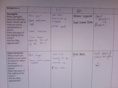
ROUGHCUT PEER FEEDBACK

the main strengths that we have been given are that:
it creates suspense
good camera shots
font
location
the main points that we have been told to improve on are:
the length
shaking of the camera
more action needed
Labels:
Jezz Eden,
Rebecca Chivers,
Thomas Edwards,
William Hall
Wednesday, 10 March 2010
Font Change
We decided to change our font because we felt that our previous one didn't fit the opening well enough. We got our new font from www.dafont.com which is a good website with many different fonts from different genres to choose from. We chose our font from the 'Distorted' section to make it look scary and to stand out. The font is called 'SA Inkspot' and it goes well with our title of 'On The Rocks'. We have decided to use this font for the credits as well as the title.
Labels:
Jezz Eden,
Rebecca Chivers,
Thomas Edwards,
William Hall
Thursday, 21 January 2010
Preliminary Task 1 & 2 Evaluation
T2-58 PRELIMINARY TASK - 2010 from SATMEDIASTUDIES on Vimeo.
We have now finished our preliminary task and we are satisfied with the overall outcome.
We feel we have improved on our primary prelim task because we have worked more efficiently and produced a better piece of film with all the cinematography needed. We had trouble with the reaction shot because we recorded it twice and they didn't fit together properly. To resolve this problem, we had to take sound from another shot and place it over the shot after the reaction shot.
T2-58 PRELIMINARY TASK - YR12_2009 from SATMEDIASTUDIES on Vimeo.
Labels:
Jezz Eden,
Rebecca Chivers,
Thomas Edwards,
William Hall
Thriller Music Practice- Murder By Numbers
20th January 2010
Today we created a piece of music of which we thought would fit the opening sequence to Murder By Numbers. To do this we used Garage Band. While doing this we also wrote down names of pieces we thought would perhaps sound good in our own opening sequence. Doing this will insure that we have an idea of the type of music we will want, and in site as to how to create our desired music.
Today we created a piece of music of which we thought would fit the opening sequence to Murder By Numbers. To do this we used Garage Band. While doing this we also wrote down names of pieces we thought would perhaps sound good in our own opening sequence. Doing this will insure that we have an idea of the type of music we will want, and in site as to how to create our desired music.
Labels:
Jezz Eden,
Rebecca Chivers,
Thomas Edwards,
William Hall
Monday, 11 January 2010
Vertigo Poster and Opening Scene Analyse
Vertigo-

opening scene-

shows an image of a man and woman. this image seems to be sketched, with the man coloured in black and the woman white. The man could be coloured in black to represent him as a shadow, giving off the sense of danger. The background colour of the poster is red, red is the colour of danger.
Saul Bass created the opening sequence to Vertigo. It consists of spirals, which makes the viewer feel anxious and nervous. They also created the feeling of falling, as if one is falling into the spirals, which ties into the plot of the feeling as the main character is afraid of heights. The music is also unnerving, using dramatic sounds to do so.
camera work
In this opening sequence, there is not so much camera as there is editing. We can, however, see that at the beginning the camera moves from the right hand side of the bottom of her face, moving slowly towards her lips, then zooming in. The camera then moves up to her eyes followed by zooming into her left eye. the camera movement is slow, and stops and starts, creates tension.
editing
The spirograph was created by Saul Bass. This is the only bit of editing within the the opening scene.
sound
The sound is synical with dramatic outburst. Music uses an arpeggio of a scale to create a more dramatized scene. This technique is repeated through out. With all these elements merged to make this music, they create tension and make the viewer feel uneasy.
mise-en-scene
there are no costumes, props ect used in this opening scene
titles
the titles are white, bold and outlined, making them dramaticly stand out again the picture.
convention
Labels:
Jezz Eden,
Rebecca Chivers,
Thomas Edwards,
William Hall
Subscribe to:
Posts (Atom)